Guides
Learn WebP workflows for faster sites with local processing, visual checks, responsive delivery, and Core Web Vitals guidance.
Learn WebP workflows for faster sites with local processing, visual checks, responsive delivery, and Core Web Vitals guidance.
A normal image file stores visual data. An optimized image file delivers the same visual message with less network transfer, less decode pressure, and fewer performance surprises. That difference matters on modern websites because images are often the largest assets in the page payload.
WebP exists for this problem. It gives teams a practical way to reduce image weight while preserving the quality needed for landing pages, product galleries, documentation screenshots, interface assets, and editorial content. It also brings several format capabilities together, including lossy compression, lossless compression, alpha transparency, and animation.
This guide explains how WebP works, where it beats legacy formats, how to use command-line tools like cwebp and dwebp, and how to deliver WebP safely with HTML fallbacks. It also connects those technical details to real workflow decisions: batch conversion, quality inspection, Core Web Vitals, browser-native processing, and deployment readiness.
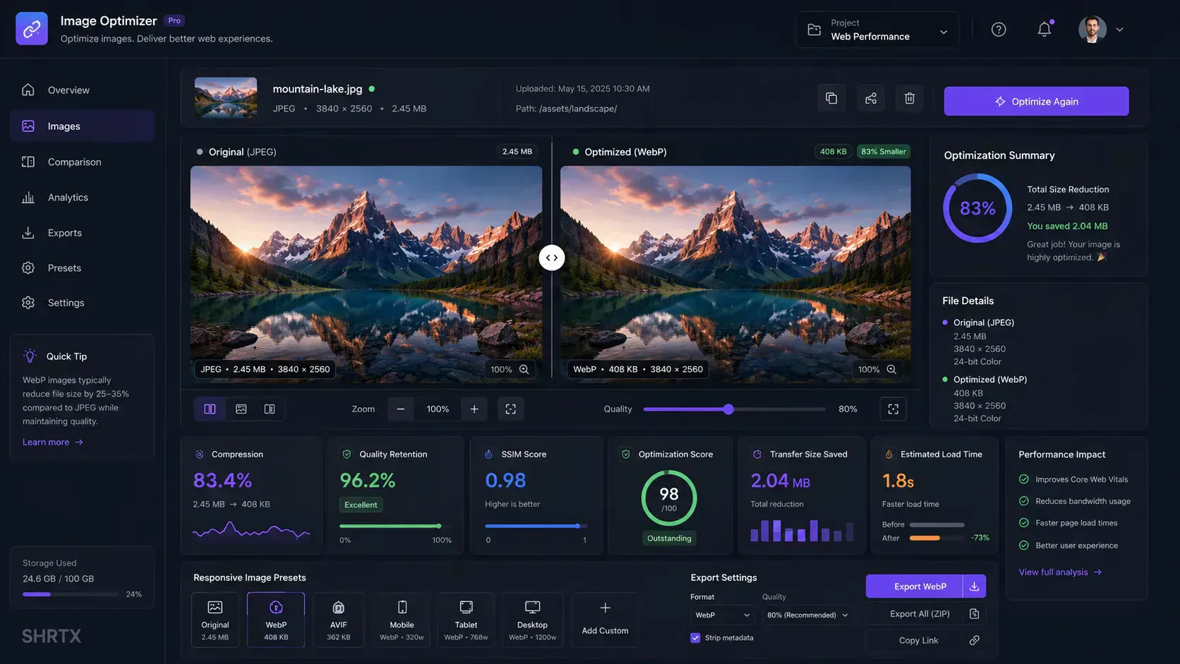
If you want a browser-based workflow for testing these ideas, start with the Image to WebP Converter. It converts images locally, shows Web-ready scoring, estimates bandwidth impact, and lets you compare original and optimized output before export.
Web performance is more than a server problem. It is also an asset governance problem. A page can have disciplined JavaScript and still feel slow if it ships oversized images into the critical rendering path.
Images affect several parts of the user experience:
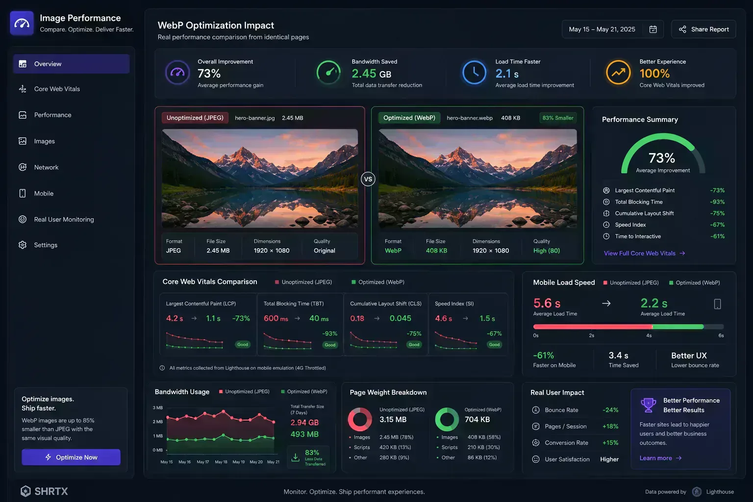
WebP helps because it usually produces smaller files than equivalent JPEG and PNG outputs at similar perceived quality. The exact savings vary by source image, dimensions, encoder settings, and visual content, but the practical pattern is consistent: WebP is a strong default candidate for web delivery.
This is why image optimization should be treated as a repeatable workflow, not a one-time export setting. Teams need to choose quality targets, inspect artifacts, preserve transparency when needed, and verify that optimized files are actually smaller.
Optimization is not about creating the smallest possible file. It is about reducing transfer cost while preserving the visual quality required for real-world delivery.
WebP is an open image format developed by Google. Its lossy mode is based on prediction techniques related to the VP8 video codec. Instead of storing every pixel in the most direct way possible, the encoder predicts pixel blocks from nearby visual information and stores the difference between the prediction and the actual result.
At a high level, the lossy path looks like this:
Raw image pixels -> predictive analysis -> residual data -> compressed WebP bitstream
That predictive strategy works especially well for photographic images, gradients, and content where nearby pixels have related structure. This is where WebP gains much of its delivery value.
WebP also supports lossless compression. In lossless mode, the encoder looks for repeated patterns, reusable pixel fragments, local palettes, and other redundancies. The output can preserve the original image data exactly while still reducing file size compared with many PNG workflows.
The useful part is flexibility. You can use lossy WebP for photos, product imagery, screenshots, and marketing assets where small visual differences are acceptable. You can use lossless WebP for UI graphics, brand assets, technical diagrams, or images where exact reconstruction matters.
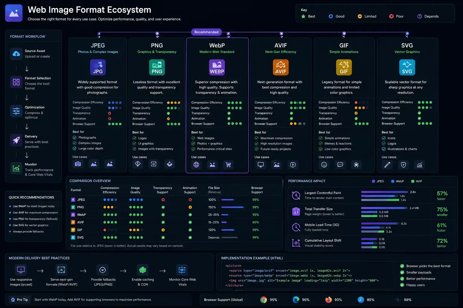
Before choosing WebP for every image in a project, it helps to understand what each format is good at. The table below turns those differences into publishing decisions.
JPEG is still strong for broad compatibility and photographic content. Its weakness is transparency. JPEG cannot preserve alpha channels, so it is a poor fit for cutouts, interface overlays, stickers, badges, and many design-system assets.
PNG works well for transparency and crisp graphics. Its weakness is file size, especially for large screenshots or high-resolution images. A large PNG can easily become one of the heaviest assets on a page.
GIF supports animation, but it is limited by an old color model and often creates enormous files for motion. Animated WebP is usually a better delivery option when browser support and platform requirements allow it.
SVG is different from the raster formats in this table. It is best for vector graphics, logos, icons, and diagrams that should stay sharp at any size. It is not a replacement for photos or complex screenshots.
AVIF can produce impressive compression, sometimes beating WebP. The tradeoff is workflow and compatibility. AVIF can take longer to encode, and already-optimized AVIF sources may not gain meaningful savings if converted to WebP. Use Image to AVIF when you want to test AVIF as a more aggressive modern delivery format.
| Format | Compression model | Best use case | Transparency | Animation | Delivery tradeoff |
|---|---|---|---|---|---|
| JPEG | Lossy | Photos, editorial images, legacy fallbacks | No | No | Broad support, but weaker for transparency and repeated recompression. |
| PNG | Lossless | Transparent graphics, crisp UI captures, exact assets | Yes | No | High fidelity, but often heavy for large photos and screenshots. |
| GIF | Lossless with limited palette | Simple legacy animation | Limited | Yes | Compatible, but inefficient for modern motion and complex color. |
| SVG | Vector instructions | Icons, logos, diagrams, scalable interface graphics | Limited | Yes | Strong for vectors, but unsuitable for photographic raster imagery. |
| WebP | Lossy and lossless | Modern web delivery, photos, screenshots, transparent assets | Yes | Yes | Strong default for web optimization, with fallback planning for strict legacy needs. |
| AVIF | Lossy and lossless | High-compression delivery and advanced responsive image workflows | Yes | Yes | High compression potential, but slower encoding and more workflow complexity. |
For most teams, the practical delivery pattern is simple: keep SVG for vector UI, keep JPEG or PNG fallbacks where compatibility requires them, test AVIF for maximum compression, and use WebP as the everyday optimization format for publish-ready web assets. That keeps the format choice tied to the page, not to habit.
The most important WebP decision is whether to use lossy or lossless output. That choice should come from the asset type and the publishing target.
Lossy WebP intentionally discards some visual information to reduce file size. This is usually the right choice for web photos, large hero images, content images, and many marketing assets. Quality settings around 70 to 85 are common starting points, but there is no universal number. A clean product photo, a gradient-heavy illustration, and a text-heavy UI screenshot can behave very differently.
Lossless WebP keeps the image data intact. Use it when exact edges, brand marks, transparency, or fine details matter more than maximum size reduction. It can be especially useful when replacing PNG assets.
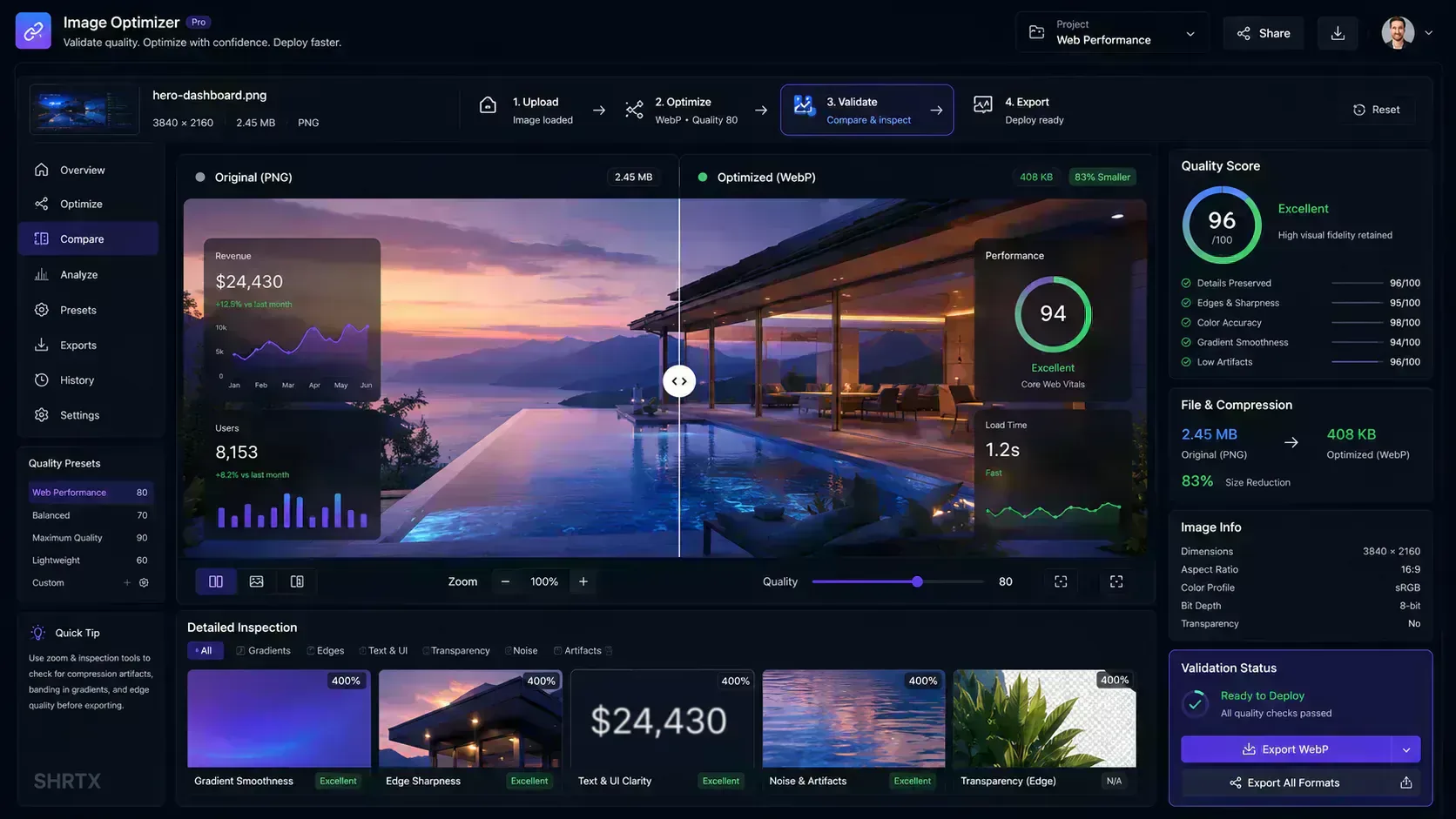
The right workflow is not just picking one mode. It is testing the output. Use comparison views, zoom inspection, and file-size checks before publishing. The Image to WebP Converter is built around that exact validation loop.
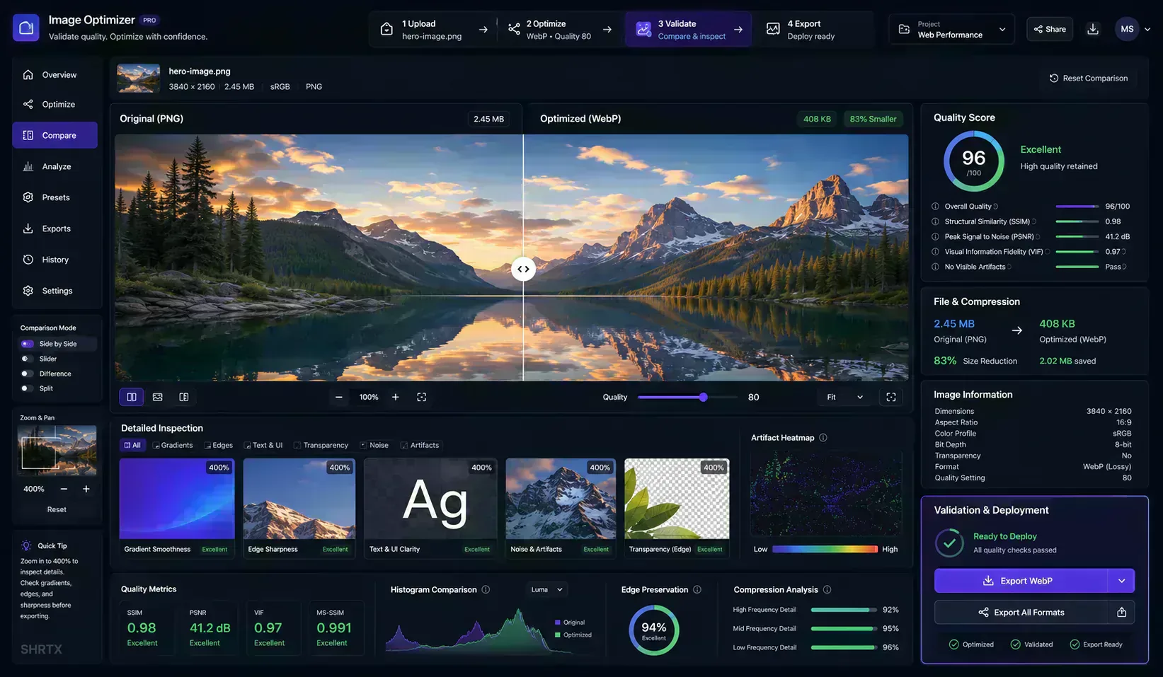
Modern image optimization is no longer only an export command. It is a workspace pattern: choose a delivery target, generate an optimized candidate, inspect the result, measure the savings, and only then publish the asset.
That model is especially useful for production delivery because different assets need different decisions. A hero image may need a higher quality preset to protect brand polish. Product gallery images may need consistent sizing and predictable compression. UI screenshots often need sharper edge retention. Social preview images need compatibility checks before they are used in metadata.
A browser-native optimization workspace can bring those decisions into one loop:
Visual validation is the part many workflows skip. Compression artifacts, transparency edges, text rendering, gradient banding, and UI sharpness can behave differently across image categories. Interactive comparison helps catch those issues before optimized assets reach production pages, release checklists, or marketing campaigns.
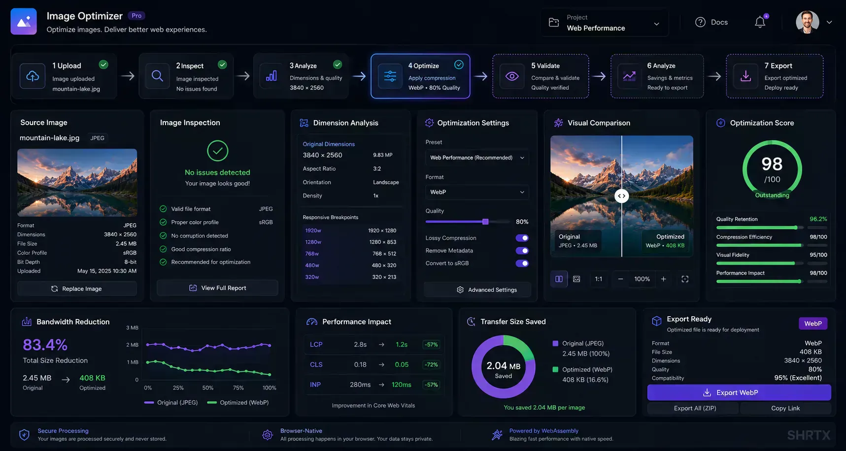
A practical optimization path looks like this:
Source image
-> Inspect dimensions
-> Choose publishing preset
-> Optimize to WebP
-> Compare quality
-> Validate performance impact
-> Export deploy-ready asset
For repeatable local workflows, the reference WebP tooling is still useful. The libwebp package includes command-line utilities for encoding and decoding images.
A basic lossy conversion with cwebp looks like this:
cwebp -q 75 input-image.jpg -o output-image.webp
Use lossless mode when exact preservation matters more than maximum compression:
cwebp -lossless source-graphic.png -o optimized-graphic.webp
For screenshots, UI exports, and sharp text, -sharp_yuv is worth testing:
cwebp -q 80 -sharp_yuv interface-screenshot.png -o interface-screenshot.webp
These commands are good building blocks, but they should still feed into a review step. A file can be technically valid and still show visible artifacts in gradients, transparent edges, or text-heavy screenshots.
When a WebP asset needs to return to a traditional format for editing or debugging, dwebp handles the decode:
dwebp compressed-asset.webp -o extracted-target.png
This is useful when a design workflow still depends on PNG or when a team needs to inspect a delivered WebP file in tooling that does not handle WebP well. Keep it as a support step, not the main publishing path.
Production projects usually need batch routines. On macOS or Linux, a simple shell loop can convert a folder of images:
for file in assets/images/*
do
  cwebp -q 75 "$file" -o "${file%.*}.webp"
done
On Windows, PowerShell can do the same kind of processing:
Get-ChildItem -Path .\assets\images\* | ForEach-Object {
  cwebp -q 75 $_.FullName -o ($_.DirectoryName + "\" + $_.BaseName + ".webp")
}
Real pipelines usually add filters for file type, output directories, retry behavior, and quality presets by asset category. Those rules keep batch output consistent across releases.
For browser-first batch work, use Image Compressor when you need a broader compression workflow, or Image Resizer when dimensions are the main problem before conversion. The goal is not just bulk output. The goal is publish-ready, deploy-ready assets that have been resized, compressed, inspected, and exported with consistent settings.
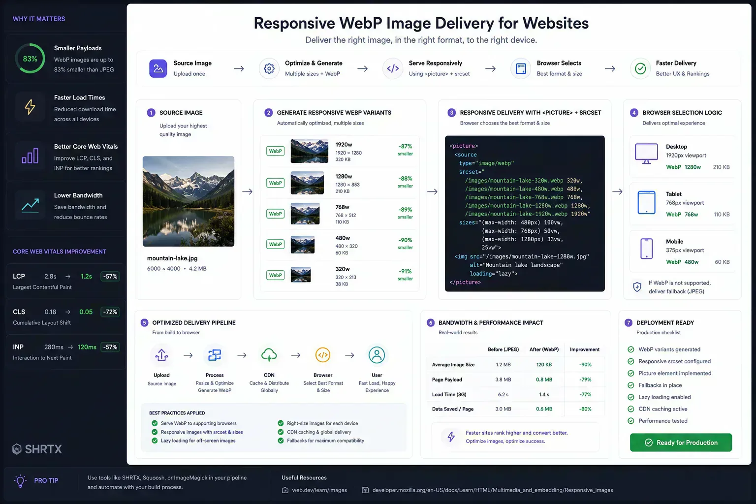
Modern browsers support WebP broadly, but production markup should still provide sensible fallbacks when compatibility matters. The safest structure is the HTML <picture> element:
<picture>
  <source type="image/webp" srcset="/images/hero.webp">
  <source type="image/jpeg" srcset="/images/hero.jpg">
  <img
    src="/images/hero.jpg"
    alt="Product dashboard showing image optimization metrics"
    width="1200"
    height="675"
    loading="lazy"
  >
</picture>
The browser checks the first supported source and loads it. If WebP is supported, it uses the WebP file. If not, it falls through to JPEG. The final <img> remains required because it provides the fallback image, alt text, dimensions, and loading behavior.
Dimensions matter. Defining width and height helps browsers reserve layout space and reduce visual instability while images load.
A single optimized WebP file is useful, but responsive delivery is usually better. Mobile users should not receive the same pixel payload as desktop users when the image renders at a much smaller size.
Use srcset to provide multiple width variants and let the browser choose the most appropriate asset for the viewport and device pixel ratio:
<img
  src="/images/product-800.webp"
  srcset="/images/product-400.webp 400w, /images/product-800.webp 800w, /images/product-1200.webp 1200w"
  sizes="(max-width: 640px) 92vw, (max-width: 1024px) 70vw, 960px"
  alt="Product interface showing optimized image delivery metrics"
  width="1200"
  height="675"
  loading="lazy"
>
Responsive WebP workflows usually create several deploy-ready widths from the same source image, then combine them with sizes rules. This reduces mobile payloads, supports high-density screens, and keeps image quality aligned with the actual rendered slot.
WebP can improve page speed, but it is not a magic switch. The biggest Core Web Vitals gains happen when WebP is paired with correct sizing, lazy loading, caching, and priority decisions. After optimization, use the Page Speed Audit Tool to check whether image delivery is actually helping the page instead of only reducing file size in isolation.
For Largest Contentful Paint, optimize the main hero or primary content image first. Convert it to WebP, resize it to realistic display dimensions, and avoid lazy loading if it is above the fold. Use Image Dimension Checker to confirm source dimensions before export, then use preload or framework-specific image priority features only when you understand the tradeoff.
For below-the-fold imagery, use lazy loading and responsive srcset rules. Smaller WebP files help, but shipping a 3000px-wide image into a 390px mobile viewport is still wasteful.
For visual stability, always reserve image dimensions. A small file can still create layout shift if the browser does not know how much space it needs. For publishing checks, pair technical optimization with Image Alt Text Checker for accessibility metadata and Social Media Previewer when the same image is used in share cards or campaign previews.
The most common mistake is converting everything blindly. Some source files are already optimized, and some AVIF files may become larger as WebP. Screenshots may also need higher quality settings than photos. Judge the output by savings and visual quality together.
Another mistake is ignoring transparency. WebP supports alpha, but lossy settings can still create edge artifacts around transparent subjects. Inspect icons, cutouts, overlays, and UI exports on both light and dark backgrounds.
Teams also forget server headers. A WebP file should be served with the correct Content-Type:
image/webp
Incorrect headers can confuse clients, CDNs, or debugging tools. Check this before assuming the image itself is broken.
Finally, be careful with social preview images. Many crawlers and messaging apps are conservative. For Open Graph images, JPEG or PNG may still be safer unless you have tested the target platforms.
Image optimization often involves private assets: unreleased product screenshots, internal dashboards, client creative, brand images, or campaign drafts. Local processing matters because it keeps files on the device instead of sending them to a remote conversion service.
SHRTX leans into this model. Browser-native tools can decode, inspect, convert, and export files inside the session. That approach fits the broader local-first software movement, where privacy and responsiveness come from doing more work on the client.
Modern browser APIs make this possible. Canvas, Blob URLs, File APIs, and download primitives allow desktop-style workflows without a server upload step. For deeper context, see Leveraging Modern Web APIs for Desktop-Class Tools.
For heavier workloads, browser performance techniques and WebAssembly can also matter. The principles in Client-Side Performance with WebAssembly are relevant when image, video, or document tools need more compute in the browser.
Use this checklist before shipping WebP-heavy pages:
image/webp headers.width, height, and meaningful alt text to rendered images.WebP is a practical format for modern image delivery. It reduces transfer size, supports transparency, works across major browsers, and fits both manual and automated workflows.
The best results come from treating WebP as part of an optimization pipeline. Resize first when dimensions are excessive. Choose quality settings by content type.
Inspect visual output before publishing. Measure bandwidth savings. Keep fallbacks where they still matter.
That is the difference between simply converting images and preparing web-ready assets. WebP is the format, but the workflow is what protects performance.
May 25, 2026 • 12 min
Learn how to check file size before uploading files to email platforms, CMS systems, cloud storage, APIs, and messaging apps. Explore browser-native payload analysis, upload compatibility checks, transfer estimates, and file optimization workflows with SHRTX.
May 17, 2026 • 15 min
Learn databending, JPEG and PNG corruption behavior, pixel-sorting pipelines, and browser-local rendering workflows for glitch art.
May 25, 2026 • 19 min
Learn how modern SaaS products, AI interfaces, and analytics dashboards use Bento Grid systems to create modular responsive layouts. Explore frontend workflow strategies, Tailwind composition techniques, and browser-native Bento planning with SHRTX.